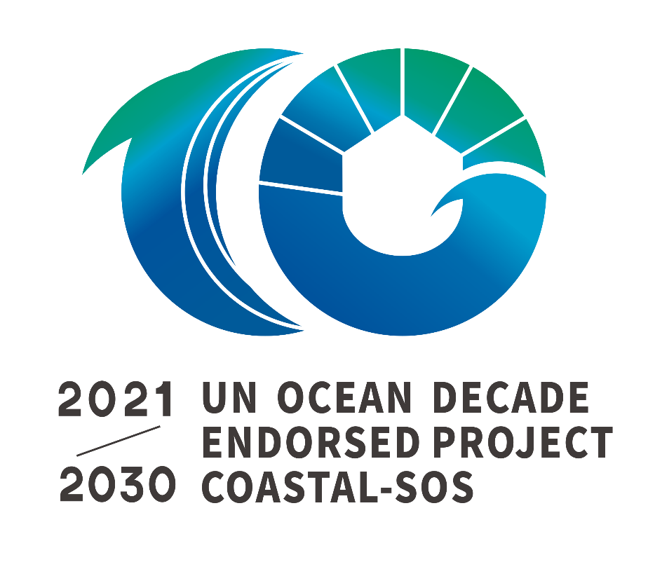
1. The overall outline of the logo presents the number 10 (“Ocean Decade”), integrating dolphin, the Earth, coastline, the moon, the Sun, waves, home and pie chart.
2. The “1” represents the moon and also a dolphin leaping over the sea and delineating beach, coastline and the sea. The dolphin (“1”) lives in harmony with the earth (“0”), conveying the harmonious coexistence of the sea, the coastline, the animals and the world.
3. The “0” represents the earth, the house in the middle representing home, the waves next to it, reflecting the harmonious coexistence of people, the ocean and the world. The pie chart above reflects the fact that the marine monitoring and modelling data is closely linked to daily life. It demonstrates the digital, intelligent, technological features. The “0” is a whole, representing the wisdom power that requires human-machine collaboration.
4. The logo shows that Coastal-SOS is a collaborative effort of multiple organizations. If the power of all partners can be united, the declining coasts will be revitalized and the future of a blue ocean can be expected.
5. The logo is composed of blue and green gradient colors, reflecting a blue ocean can bring healthy ecology to the world and bring vitality and hope to humankind, conveying the concept that protecting the ocean is protecting the earth.
6. The logo is composed of the sun and the moon, meaning the sun and the moon together. It embodies the spirit of the Ocean Decade and the vision of sustainable and harmonious development.
7. The overall logo is concise and informative, in line with the project positioning.
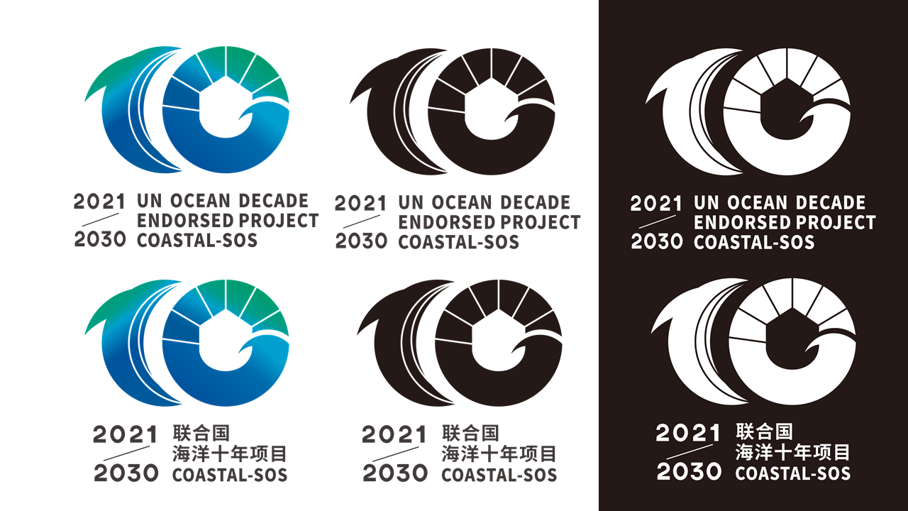
Different versions of COASTAL-SOS logo